144 years of marriage and divorce in the United States, in one chart
We often hear that marriage rates in the U.S. are
declining. But what do trends in marriage and divorce really look like over
the long run, and why?
In a
new post, data tinkerer Randy Olson provides some clarity on those trends by
pain-stakingly assembling and analyzing data on marriage and divorce rates going
back to before 1870 from the CDC's National Center for Health Statistics.
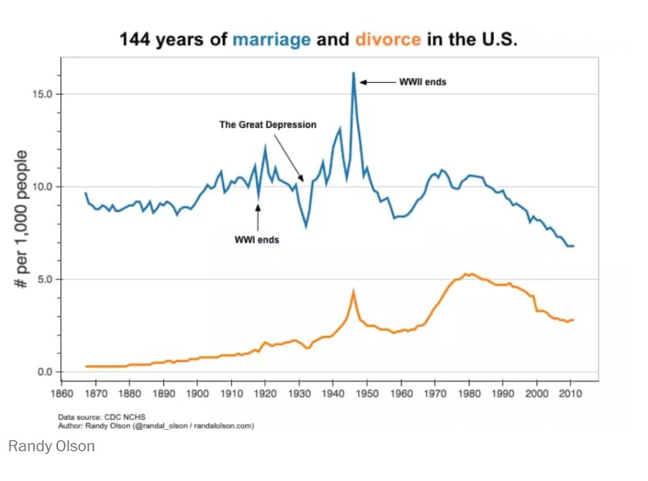
Here is Olson’s graph of the number of marriages and divorces per every 1,000
people in America since 1867:

First, you can see that the common generalizations are true. As the chart shows,
marriage rates have declined steadily since the 1980s. Today they are lower than
any other time since 1870, including during the Great Depression. However,
divorce rates today are actually slightly down compared with the 1970s, ’80s and
’90s on a per capita basis.
In addition, you can see that events like World War I, World War II and the
Great Depression all had a significant impact on marriage and divorce rates.
Couples rushed to the altar before the wars started, as well as at their
conclusion. As Olson notes, divorces also spiked after the conclusion of WWII,
perhaps because some couples who had married rashly before the war realized
their differences.
The chart also shows an obvious drop in marriage rates during the Great
Depression of the 1930s. Fewer jobs and less economic stability appears to be a
popular reason for not forming new families — a trend we also saw during the
Great Recession.
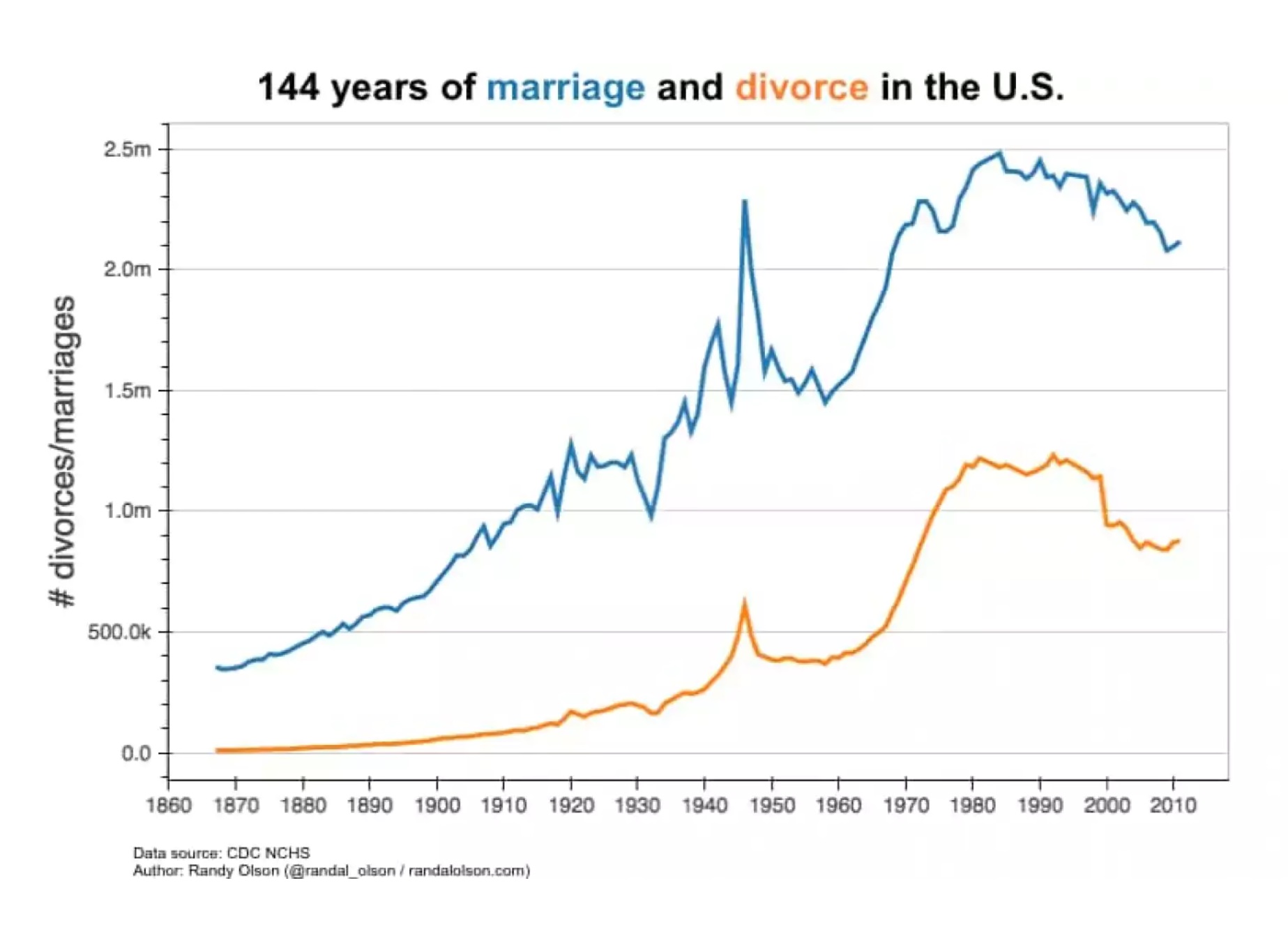
This second chart shows the raw counts for marriages and divorces (not adjusted
per capita, like the first chart):

As Olson writes, the second chart makes clear that the dip in marriages and
divorces in the 1960s that you see in the first chart is due in part to the
post-war population boom. A surge in Baby Boomers in the 1950s and 1960s greatly
increased the population; since the Boomers were almost all too young to marry,
the per capita marriage rate declined. Once the Boomers got old enough to tie
the knot, marriage rates rose back to pre-WWII levels.
You can see an interactive version of Olson's chart here.
A previous version of this post incorrectly
said that the first chart showed the number of marriages and divorce per every
10,000 people. The post has been updated.
Source

